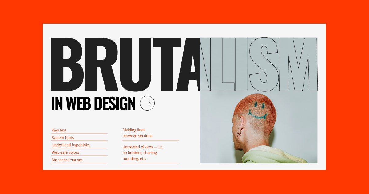
Brutalism, originally an architectural style known for its raw concrete forms and stark, utilitarian look, has found unexpected influence in digital user interface (UI) design. In contrast to sleek, overly-polished aesthetics, brutalist web and app design embraces barebones layouts, bold typography, and unfiltered functionality. This style often shocks at first glance, but its clarity and anti-corporate stance have made it appealing to independent creators, artists, and developers seeking authenticity over perfection.
Design experts argue that digital brutalism responds to the saturation of “safe” user experiences—sites that all look and feel the same. By using asymmetry, exposed grids, and minimal color palettes, brutalist UI designs create memorable user interactions and push the boundaries of web convention. Critics praise it for its honesty: nothing is hidden, and nothing is softened. Instead, it demands user engagement through form that prioritizes content over polish.
What makes this trend notable is its adoption by underground art platforms, experimental blogs, and even social justice campaigns. Brutalist design isn’t just aesthetic—it often reflects resistance, rebellion, or urgency. It offers designers a unique way to break norms while retaining functional intent. As the digital world becomes increasingly homogenous, brutalism continues to rise—not as a default, but as a deliberate, disruptive choice in the visual language of the internet.